Project 5
For our Final Project, we were tasked with creating another set of 2 cups, 2 plates, and 2 bowls. This set should build on the skills we practiced on our first set and should take another creative direction.
Ideation Process
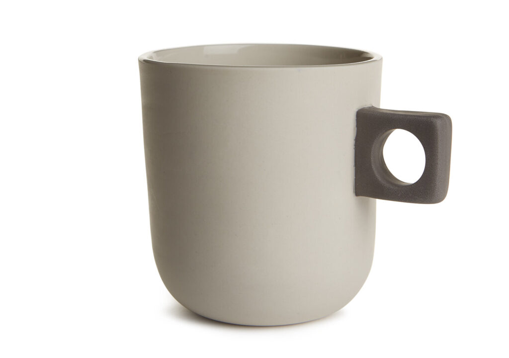
For my second set of tableware, I decided to do the opposite of my first theme which was “gross” and “unnatural”. This theme, I wanted to focus more on growth and comfortability. I designed my pieces to be different in the way the user interacted with them, so I tried to make it unconventional yet comfortable.
Images/ Sketches
The Process
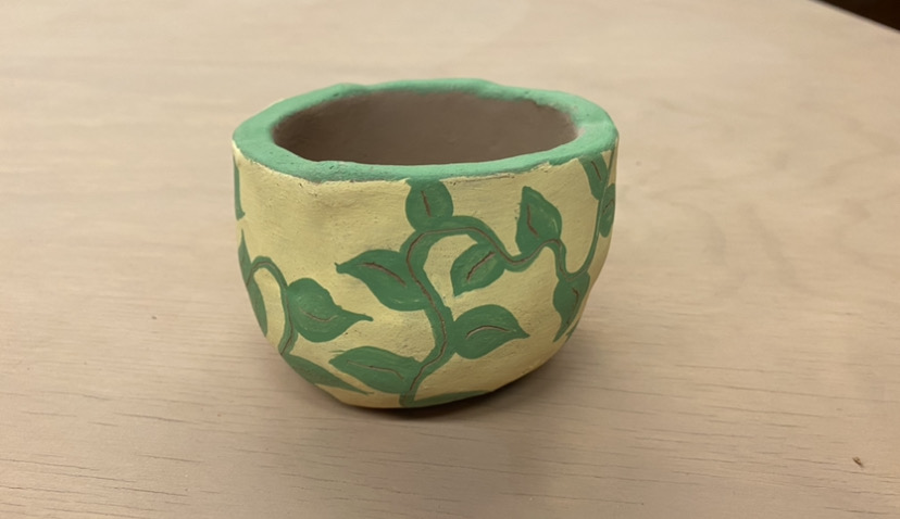
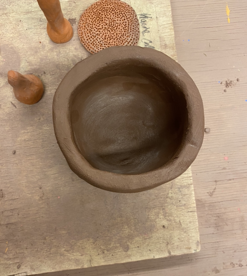
Final Product
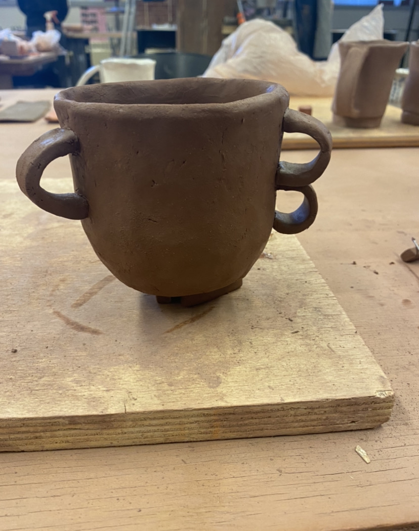
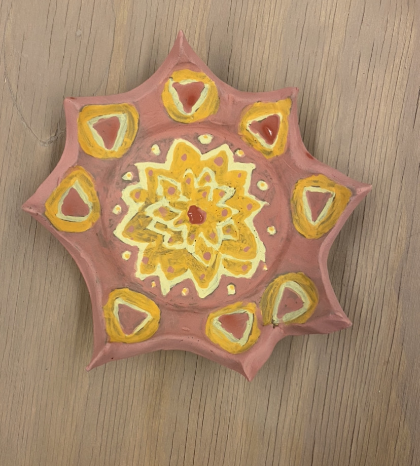
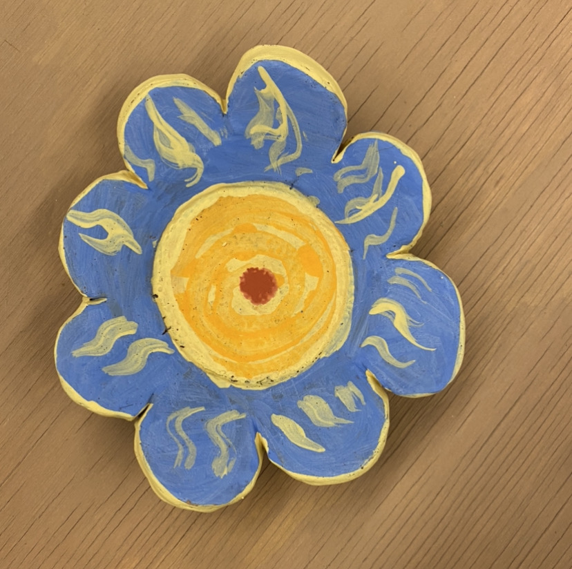
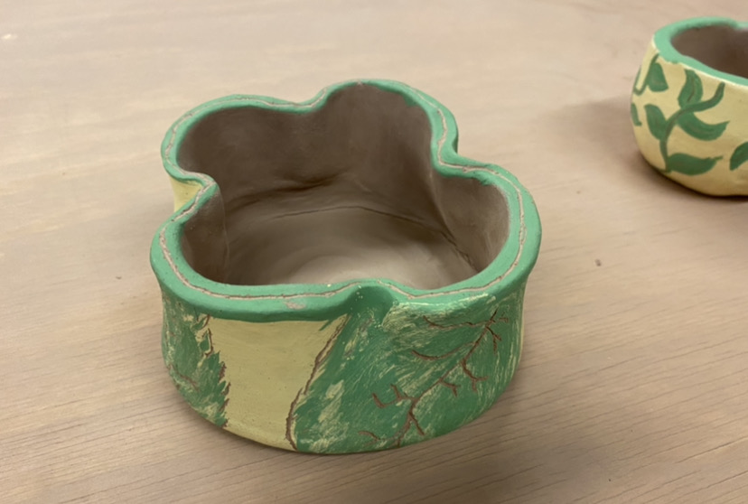
This set is to be used in any occasion and is meant to bring comfort and familiarity with use. The plates are small in size, so it would be best used for smaller portions or as a dish of some sort. I used smooth texture in my cups since the user handles them the most, and then I used guiding lines and sharp edges in my bowls and plates. I used the same color patterns for each set of items, but alternated with my plates.
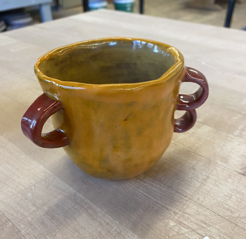
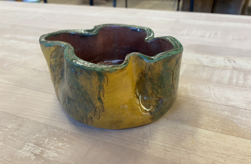
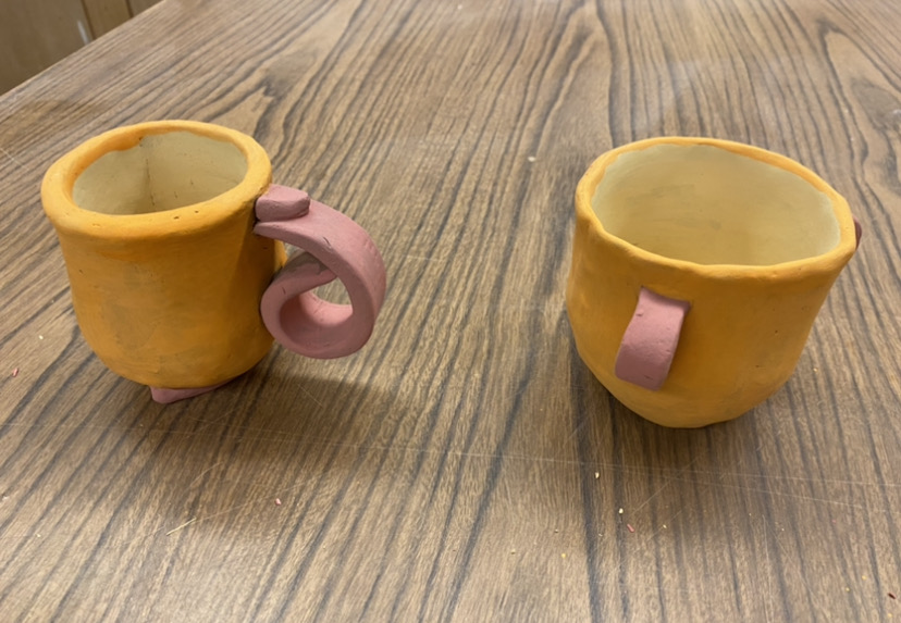
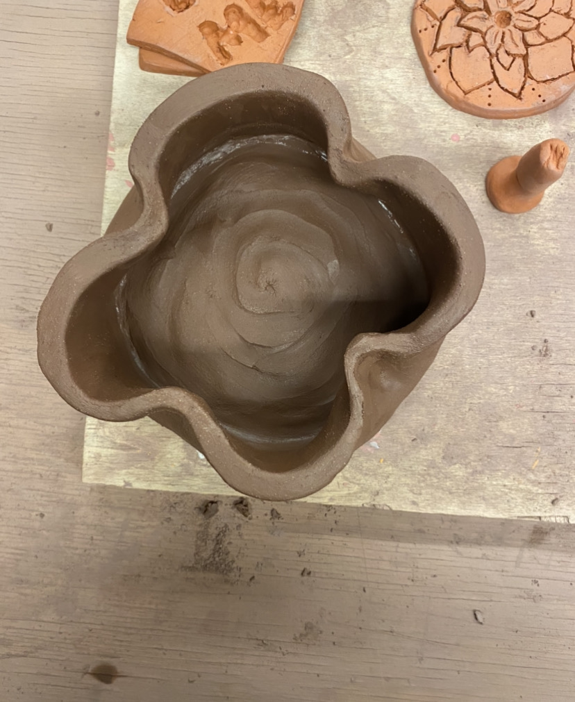
The pictures above show the finished pieces of my second and final set of tableware. For the cups, I made the handles a unique style so the user has to hold it differently. The first cup has spots for your pointer, middle, and thumb to fit in and the second cup had a handle for your fingers to wrap around and a thumb rest. This design was to make it comfortable and seamless to hold, much different than my previous set where the handles were meant to be unappealing (old banana peel and a worm). I used the same pattern of color, (yellow outside, red handles, and orange inside) to make the cups relate.
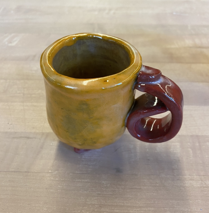
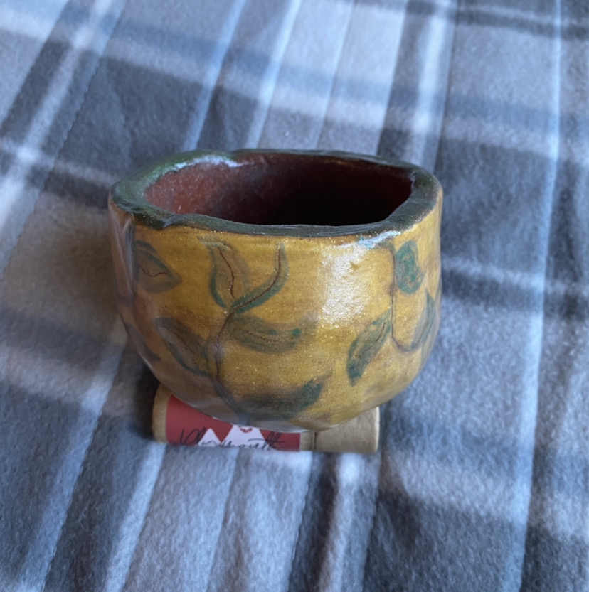
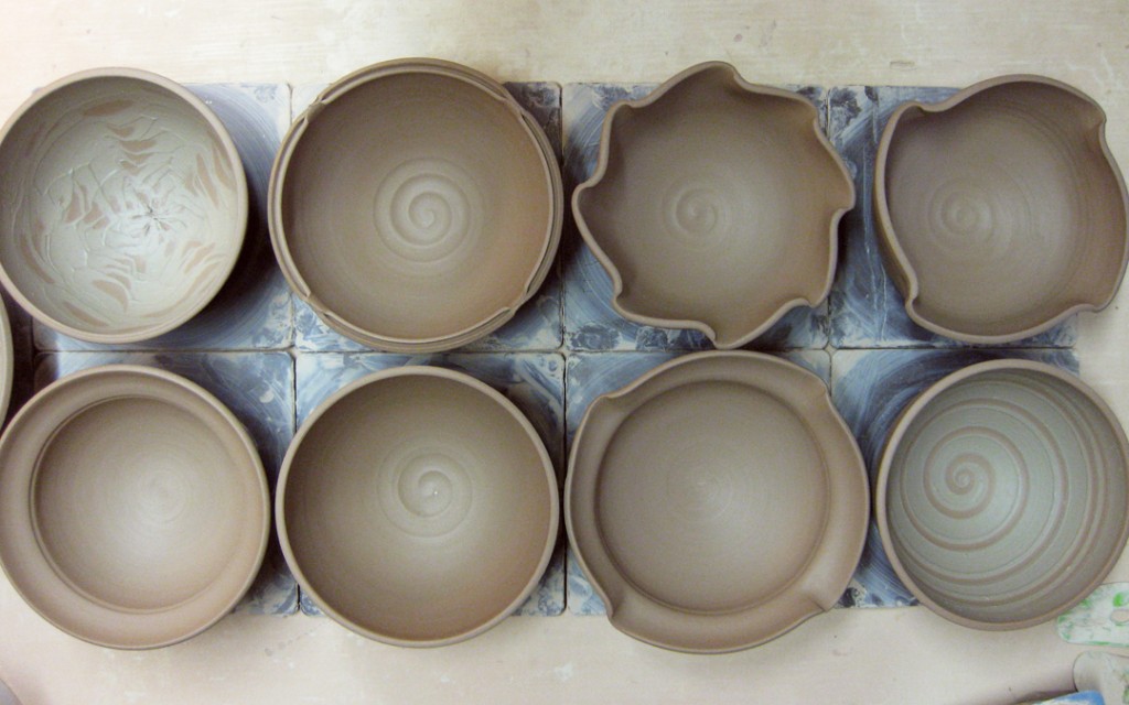
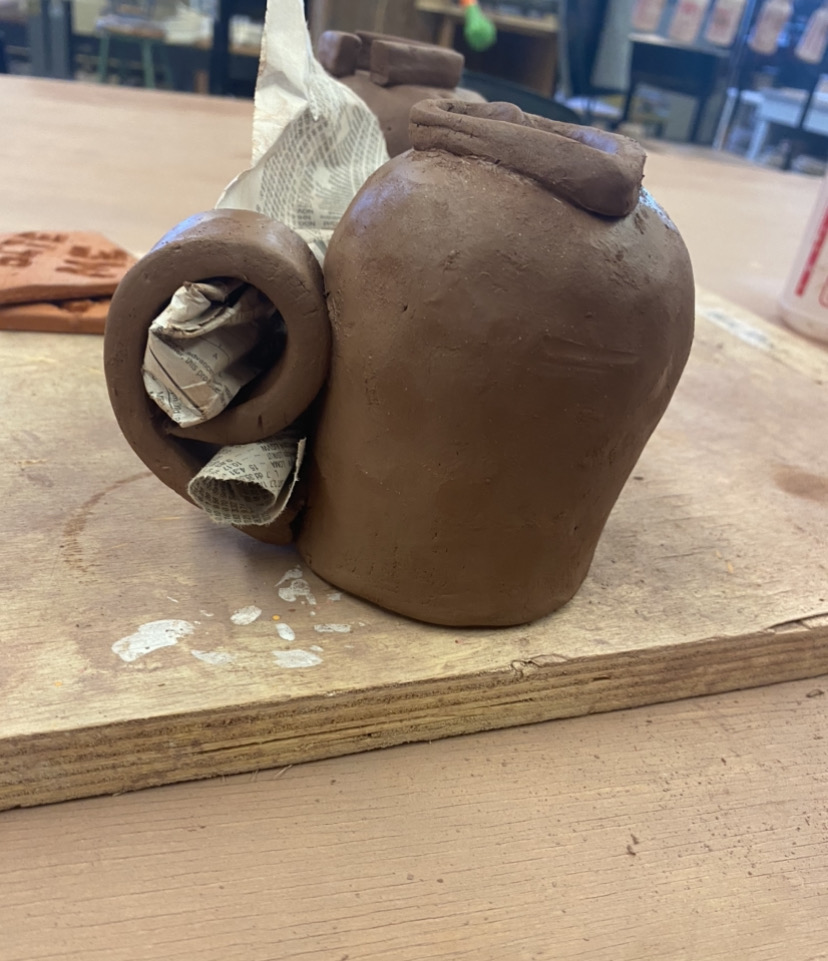
My bowls were meant to represent growth in terms of plants. I carved away at the guiding lines to create texture on the piece. The use of yellow, green, and the natural brown color of the clay were emphasized so the piece connected more with nature. I made the lip of my first bowl asymmetrical and fluid, which creates a dynamic piece, representative of movement and growth. These bowls focus more on growth and visually pleasing pattern rather than my first set, where the goal was discomfort and user difficulty.
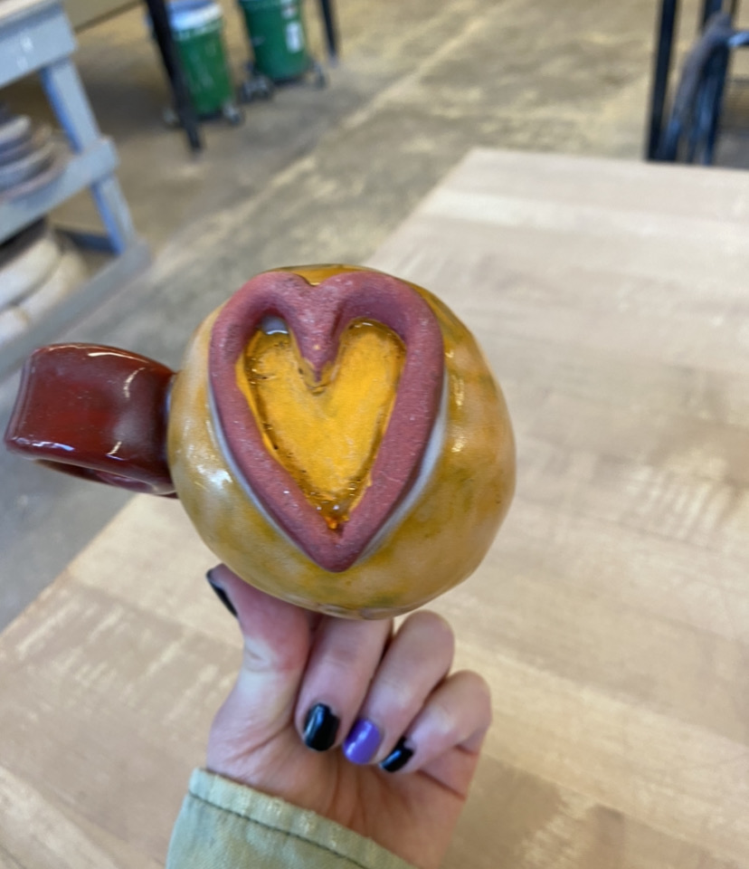
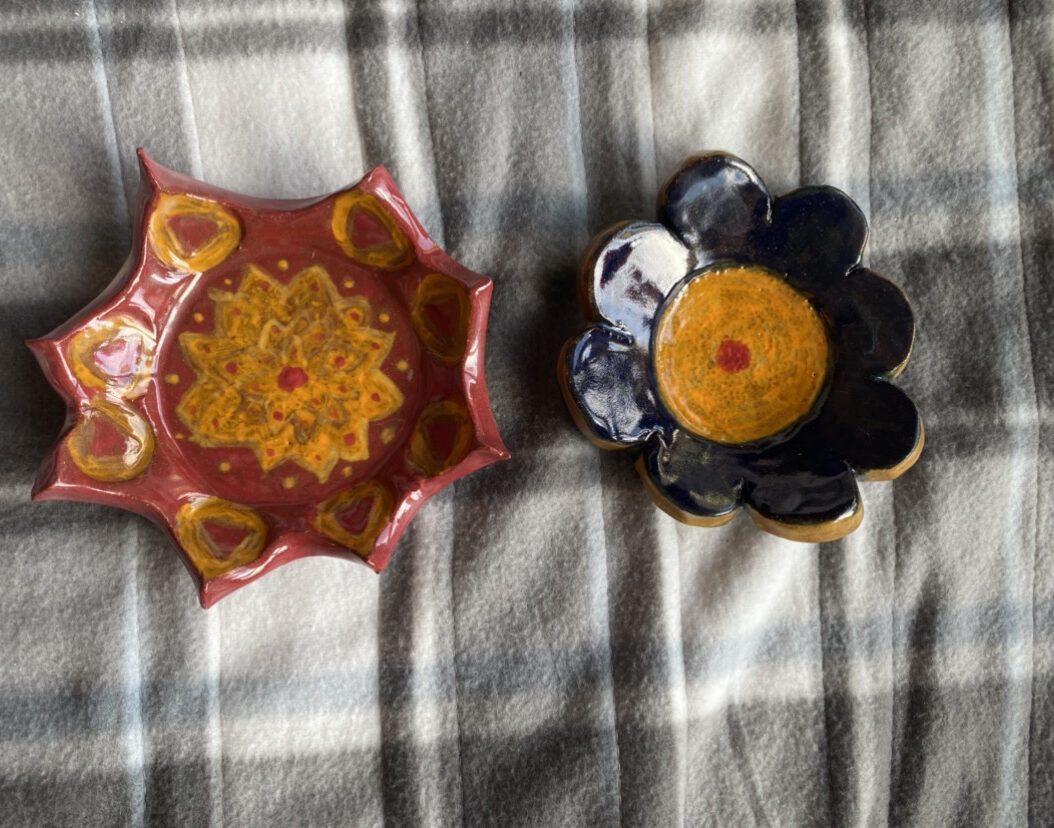
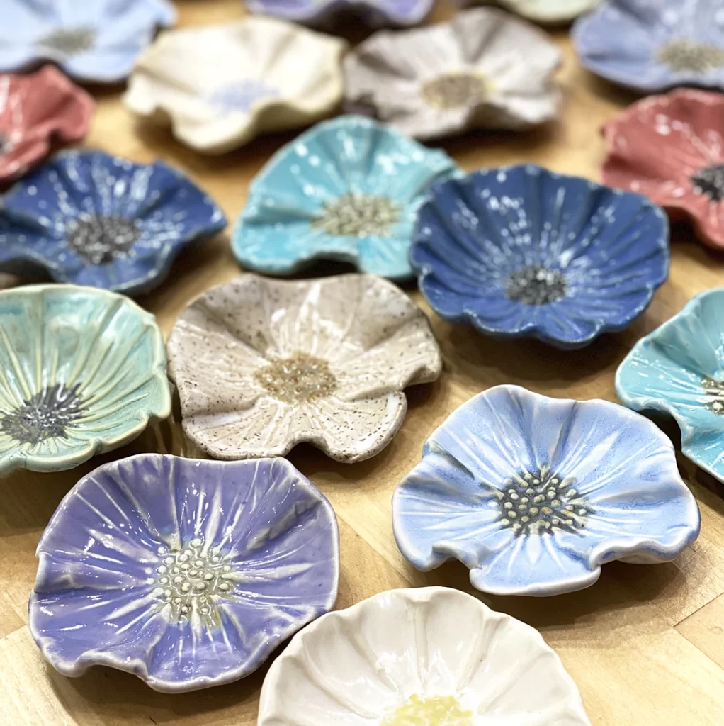
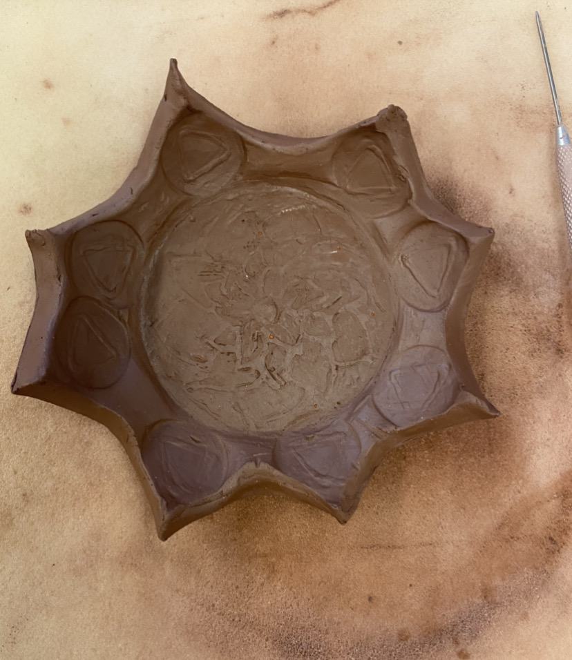
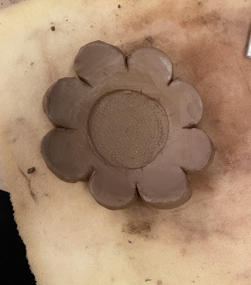
My final plates were meant to be representative of flowers in shape and color. My first plate has sharp edges and a repeating pattern of triangles that line the edges. The texture of the edges are sharp and pointy, much like the thorns of a flower. The image in the middle is an abstract flower. The second plate has a focal point in the middle where the red dot is, and it’s meant to be the center of a flower. These plates have similar colors to my first set, but are more developed in style, pattern, and technique.
