Project 4: Texture Tile Press Plates
For this project, we were assigned to use the tiles we created in project 2 to create 2 press plates.
Ideation Process
I didn’t know exactly how to incorporate my “gross” theme into the tiles, but I knew that I wanted the edges to be pointed, kind of like an “x”. I opted for using the words “don’t eat” and “bite me” as they are opposite in verbiage but similar in connotation. However, I didn’t account for needing to create a mirror image, so my plates’ words came out backwards which was disappointing.
Images/ Sketches
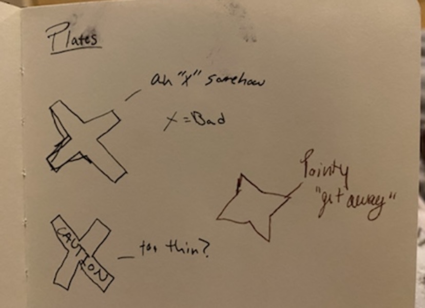
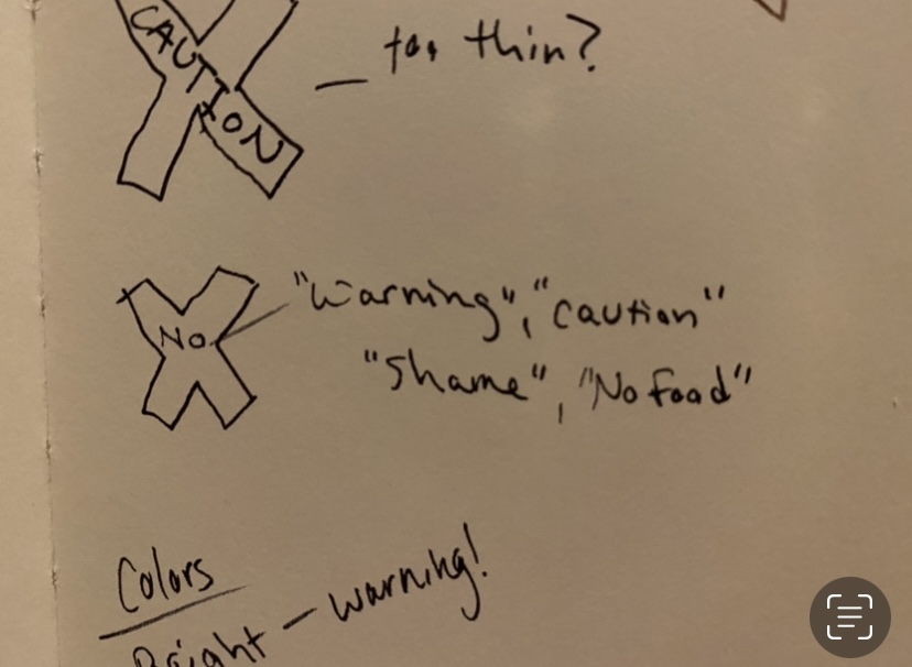
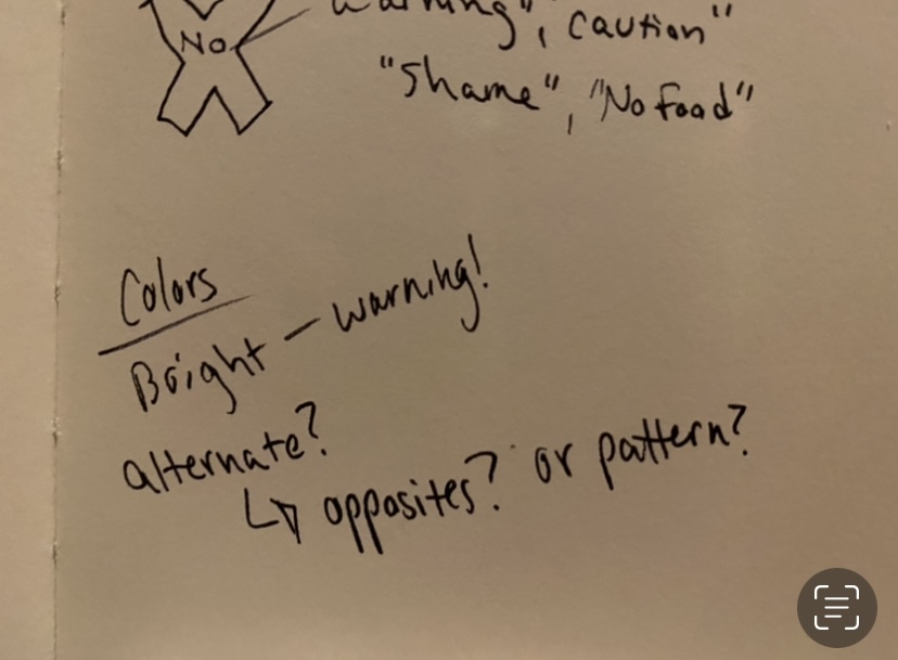
The Process
Stage 1
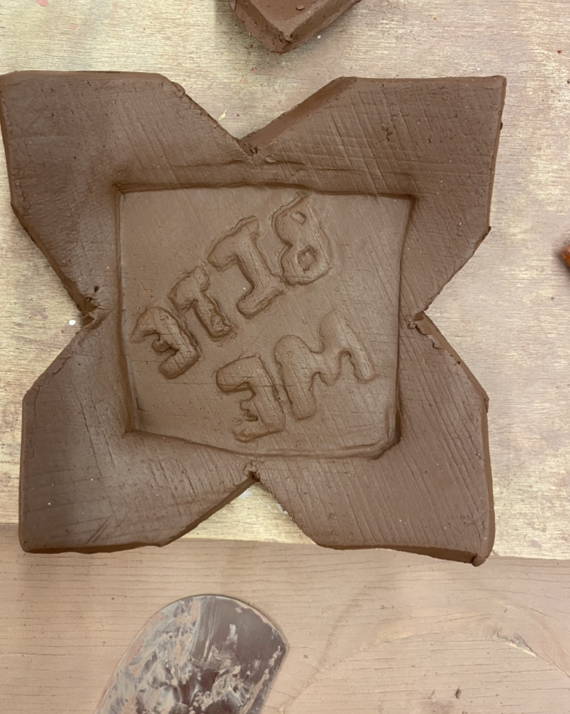
Stage 2
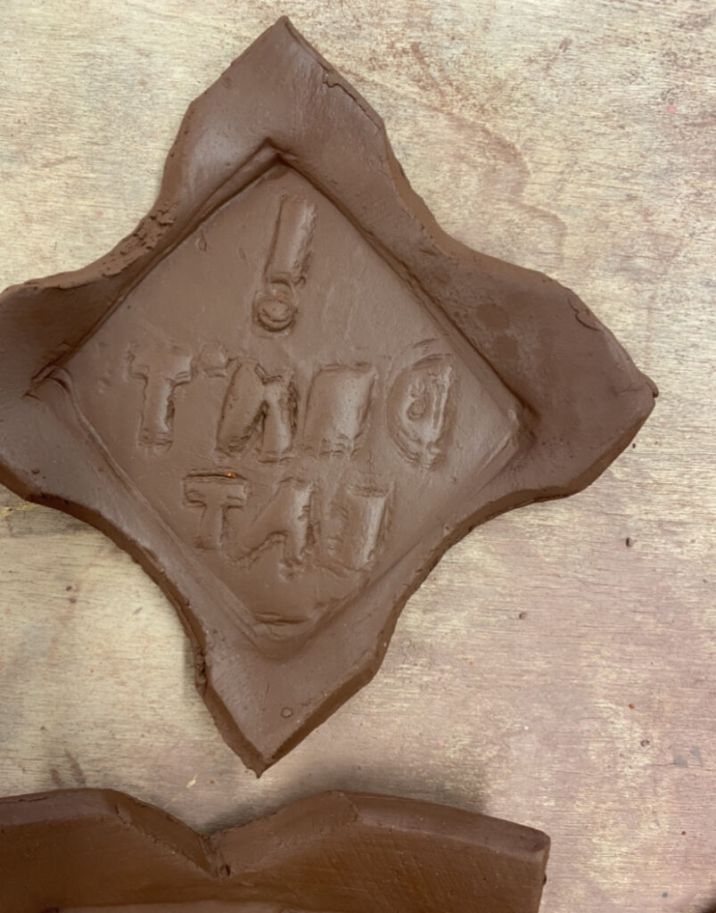
Stage 1
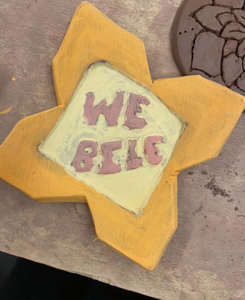
Stage 1
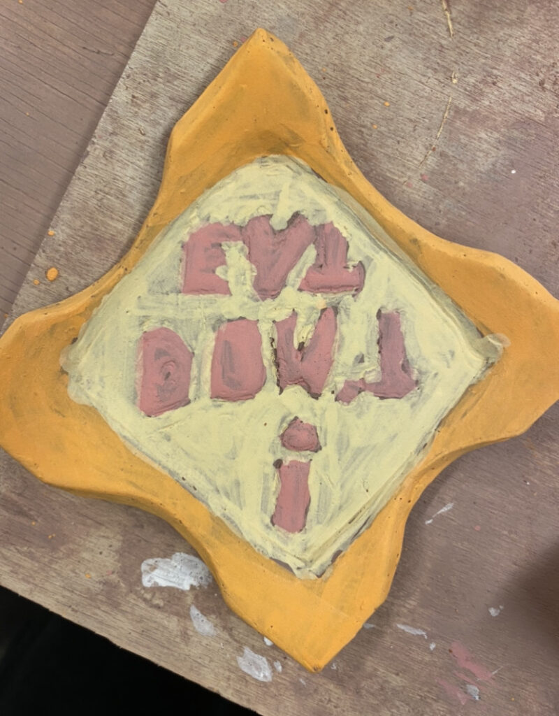
Final Product
asdasd
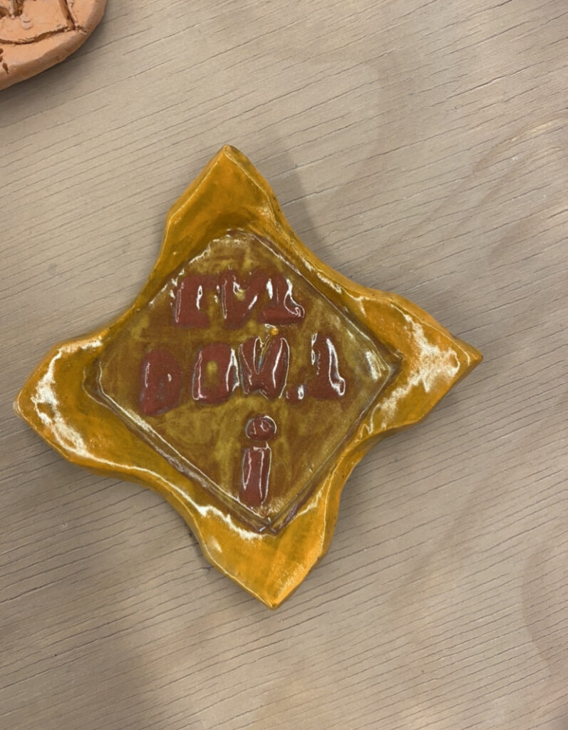
This is the first plate that I made and it is supposed to say “Don’t eat!”. The sides of the plate are thin in proportion to the middle, and the color did not come out as bright as I wanted it to. The composition is static, it is a flat piece that has no movement.
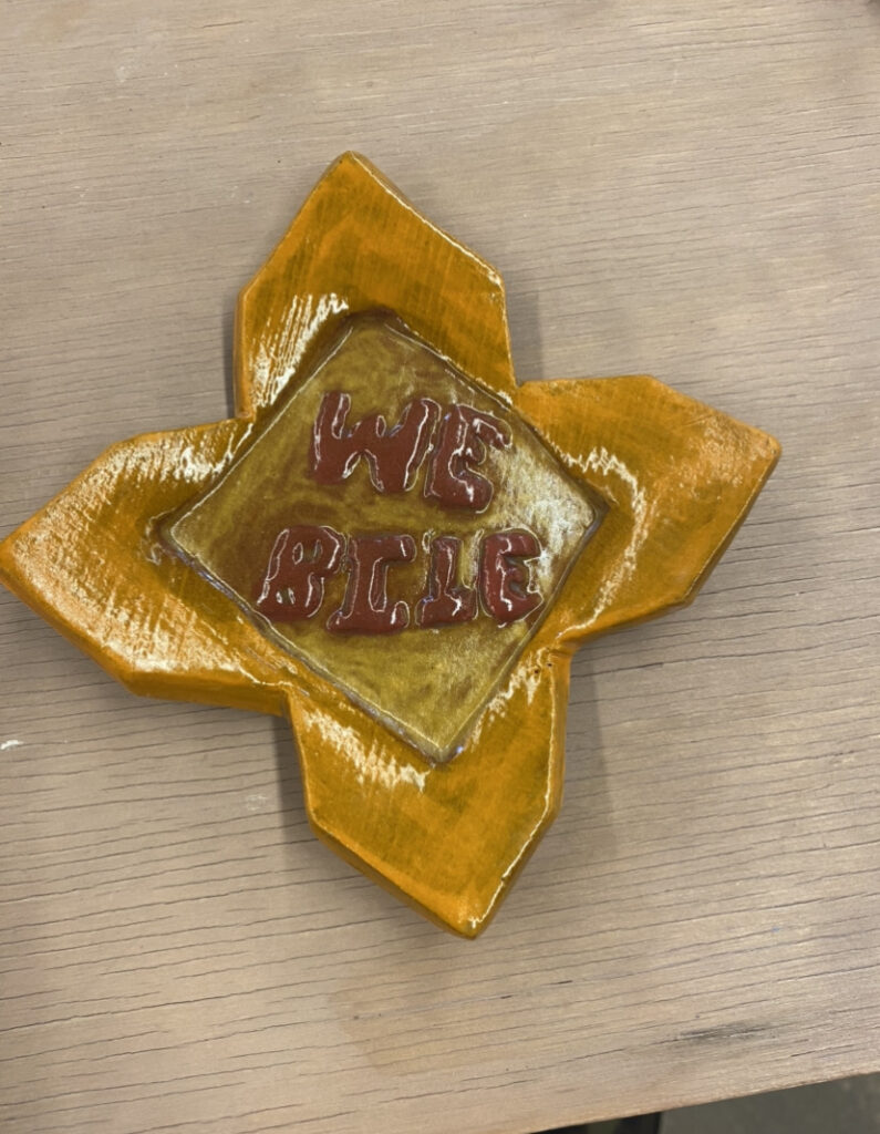
This is the second plate that I made, and I was happier with the size and shape of the sides. The size and location of the sides are more symmetrical, which allows for the focus to be on the middle of the plate. The plate is 3-dimensional, since the text pops out of the plate.I kept consistent with the pattern of color in the previous plate.
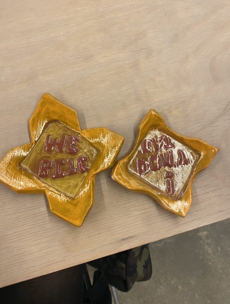
These are my plates side by side. Overall, I am disappointed with how they turned out, but I learned how the brighter colors take to the clay, the importance of a mirror image, and general technique with creating a plate.
